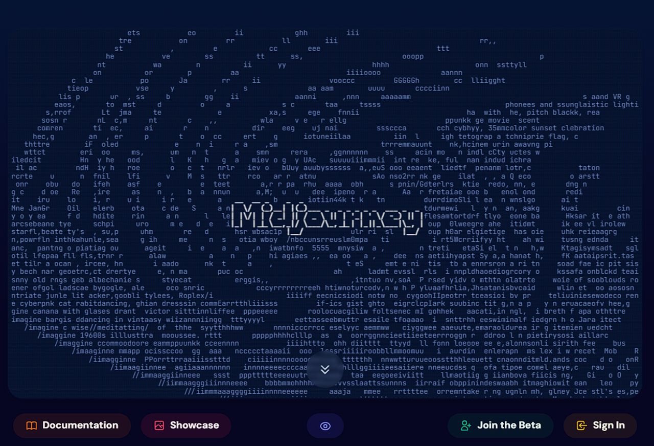
Midjourney, the well-known AI art generation system and independent research lab, has announced the rollout of phase 1 of its new website design making it available on a beta subdomain for users to check out. This initial phase focuses on enhancing the user experience in searching, browsing, and viewing images. However, it has also sparked some debate due to the absence of certain features and the removal of others. As a Midjourney user, one of the best features in phase one for me is the ability to search through all your AI generated images much more quickly than previously. Simply use your mouse wheel to scroll through thumbnails of all your images from the creation of your account to today.
The new website design exhibits a few minor changes, including the introduction of light and dark modes. This feature allows users to switch between different visual themes to suit their personal preferences or environmental conditions. One of the major changes in this phase is the absence of image generation features. While this has been a staple in Midjourney’s offerings, the company has chosen to exclude it in this initial phase. Although Midjourney artists can expect this feature to be included in the upcoming releases, along with organization features such as collections.
The redesign also sees the removal of the hot, top, and rising pages. These popular features provided users with a quick way to discover trending content. The removal of these features is a surprising move, and users have been quick to voice their concerns.
Another significant change is in the way images are displayed and the options associated with them. Clicking on images now brings up a new ‘lightbox’ mode, which users can quickly scrub through with scrolling or arrow keys. Further clicking on an image while in ‘lightbox’ mode puts users in an ‘immersive’ view where they see the images and nothing else. This change aims to provide a more focused viewing experience.
Midjourney new website design
Other articles we have written that you may find of interest on the subject of Midjourney :
The rating page has also been updated with a quick selection feature. Users can now press the 1,2,3,4 keys to rate images quickly while scrubbing through their own images. This new feature aims to streamline the process of rating and sorting images.
In addition to these changes, the new design includes external links to the Discord server, billing support, and documentation pages. While these links provide easy access to additional resources, some users have noted an overall decrease in website features with each update.
To learn more about the latest Midjourney website redesign features check out the video below kindly created by AI digital artist Thaeyne. Explaining more about what has been added and taken away and what you can expect to be made available in the near future
Midjourney phase 1 website design overview
The new search feature has also received mixed reviews. Personal search is now done inside the user’s own browser, providing instant results. However, some users have critiqued this feature due to the absence of a model and version filter for images.
Similarly, the removal of image size display and the parent-child chain of images has been met with mixed reactions. While some users appreciate the cleaner design, others miss the detailed information these features provided.
The rollout of phase 1 of Midjourney’s new website design brings a fresh look and feel to the platform. However, the absence of certain features and the removal of others have raised questions about the company’s direction. As this is only the first phase of the redesign, it will be interesting to see how Midjourney addresses these concerns in the upcoming updates.
Filed Under: Technology News, Top News
Latest aboutworldnews Deals
Disclosure: Some of our articles include affiliate links. If you buy something through one of these links, aboutworldnews may earn an affiliate commission. Learn about our Disclosure Policy.

