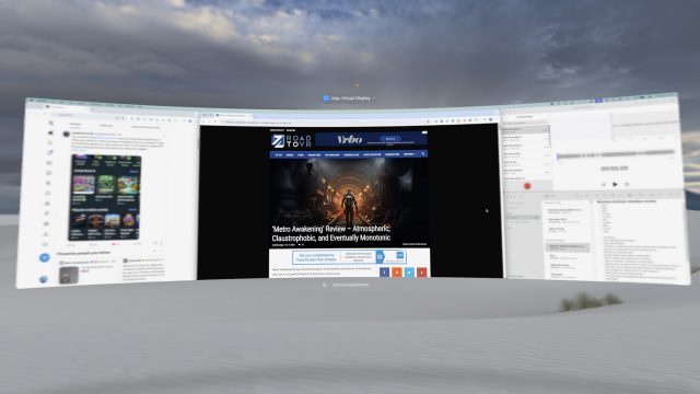
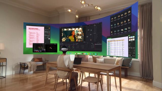
Apple has finally dropped the ultrawide virtual display for Vision Pro in beta, giving the existing virtual display feature the ability to stretch to wide and ultrawide widths for extra screen real-estate. Out of the box it’s impressive, but default MacOS window management makes it kind of a pain to use. But with the right third-party window manager, it’s even better than I hoped for.
I’ll be honest, I didn’t know just how useful the new ultrawide feature would be. I’ve used Vision Pro’s virtual desktop feature many times before. It’s a great way to get some extra screen real-estate out of my MacBook Air (M2). But it was limited in that it could only really act like a single, large 16:9 monitor.
My productivity workhorse is my desktop PC on which I’ve used two side-by-side monitors for years. For a power-user like me, having the extra width to have multiple things on screen at once is great; constantly minimizing and maximizing apps is a pain. I also combine my dual monitors with additional virtual workspaces, meaning I can group applications together on a specific workspace for a specific task.
I’ve yet to make the leap to a single ultrawide monitor over dual monitors. They’re pretty damn expensive and physically take up a lot of space.
But with a little software update, Apple just gave me an ultrawide monitor that I can take with me wherever I take my Vision Pro. The ultrawide setting essentially gives you two 16:9 monitors side-by-side, but without the seam in the middle if you were using dual monitors.
So not only is my little MacBook Air now able to replicate all the screen real estate that I have with the big setup that takes up my whole office desk, it also has the benefit of no seam in the middle of the monitors. I didn’t fully appreciate how much this would increase the flexibility I have with setting up my workspaces. Now it’s easy to span an app seamlessly in the ‘middle’ of the workspace, while less important apps can be on the flanks. It’s great! But…
MacOS window management is simply not ready to handle ultrawide monitors. Even though Apple just added improved window tiling in the latest version of MacOS, it really isn’t very helpful on an ultrawide monitor.
At best you can ask the system to put an app into any quarter of the monitor, but this results in super-wide apps that aren’t useful in that particular shape. You can make a window go to just one half of the screen, but that gives you a maximum of only two apps on the screen at once.
Without window management that’s actually made for ultrawide monitors, you’re stuck doing a lot of resizing of windows to get them into useful arrangements to really take advantage of all the space you have. Or you do the seemingly insane thing Apple always shows in their marketing: just use randomly sized windows that overlap with other windows while also wasting a bunch of screen space. I mean look, this is literally what they showed when promoting this feature:
Being able to quickly get apps into useful size and position is essential to really benefiting from an ultrawide monitor. The more time it takes to size and position apps, the less often you’re going to actually use the extra space to your benefit.
Luckily there’s many third-party window managers out there for MacOS. And I would argue that having one is essential if you’re using the Vision Pro ultrawide virtual display.
Here is a look at MacOS’s built in quadrant window tiling which is not remotely useful for an ultrawide monitor. Then you see a third-party tool that makes things much better.
For now I’ve landed on a window manager called Rectangle. With it I can easily set up a ‘main’ app in the center 2/4 of the monitor, then stick apps in the remaining 1/4 on the left or 1/4 on the right. Or I can even stack two apps on the sides, taking up 1/8 of the monitor each.
This works great and makes me feel like I have even more room than I did when using two physical 16:9 monitors (again, the lack of gap in the middle is a surprising benefit because you can put your most important app directly in front of you).

Although Rectangle has the features that make this work well, the app itself is overcomplicated; like using a sledgehammer when all you really need is a regular hammer. There still might be a more streamlined solution out there.
There’s really no reason why MacOS itself shouldn’t have similar window-arranging capabilities that actually make sense for ultrawide monitors, especially now that Vision Pro doubles as one.
Anyway… with the window management issue taken care of, I’m finding the ultrawide virtual display feature even more useful than I expected. When combined with MacOS’s built-in Spaces feature—which allows me to slide easily between multiple ultrawide workspaces—my little MacBook Air feels like an absolute productivity powerhouse. It’s wild to me that it can run five ultrawide workspaces worth of apps and still feel nice and smooth.
For me, the ultrawide option (with some third-party help) has changed Vision Pro’s virtual display feature from something that’s nice to have here and there, into an essential capability of the headset.
Now listen, some of you who have made it this far might be thinking to yourself: “to some extent you’re just praising ultrawide monitors in general.”
You’re not wrong. But the thing is, this one fits in my headset, which means I can bring a highly productive workspace with me anywhere that I would take my laptop.
Vision Pro is still too heavy to want to use this setup all day (and it’s still more expensive than an ultrawide monitor itself!). But mark my words: once Apple has an equivalent headset that’s half the size and half the price, people are going to see huge value from this kind of work setup.


